
01.
Building the Brand Strategy
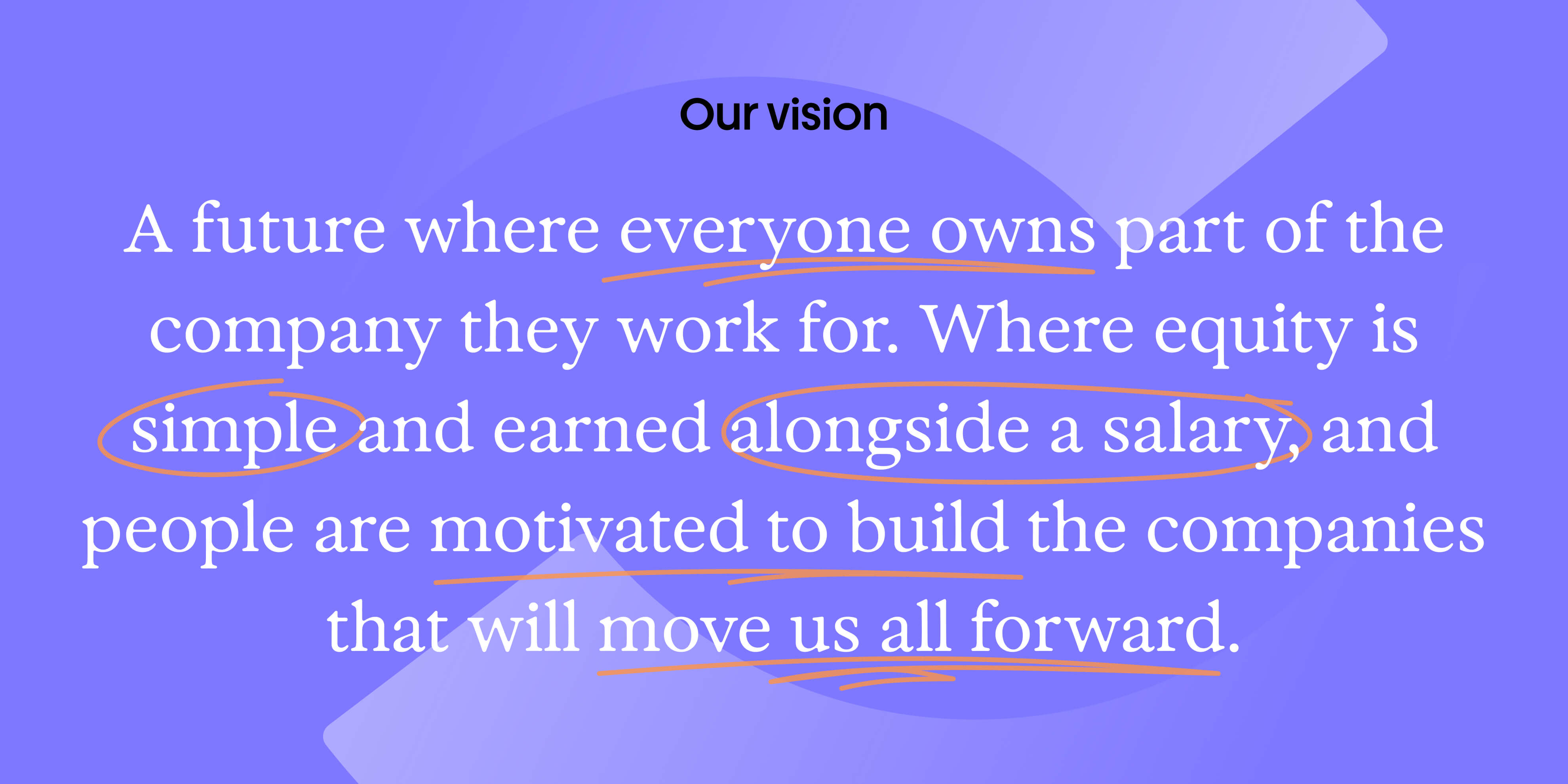
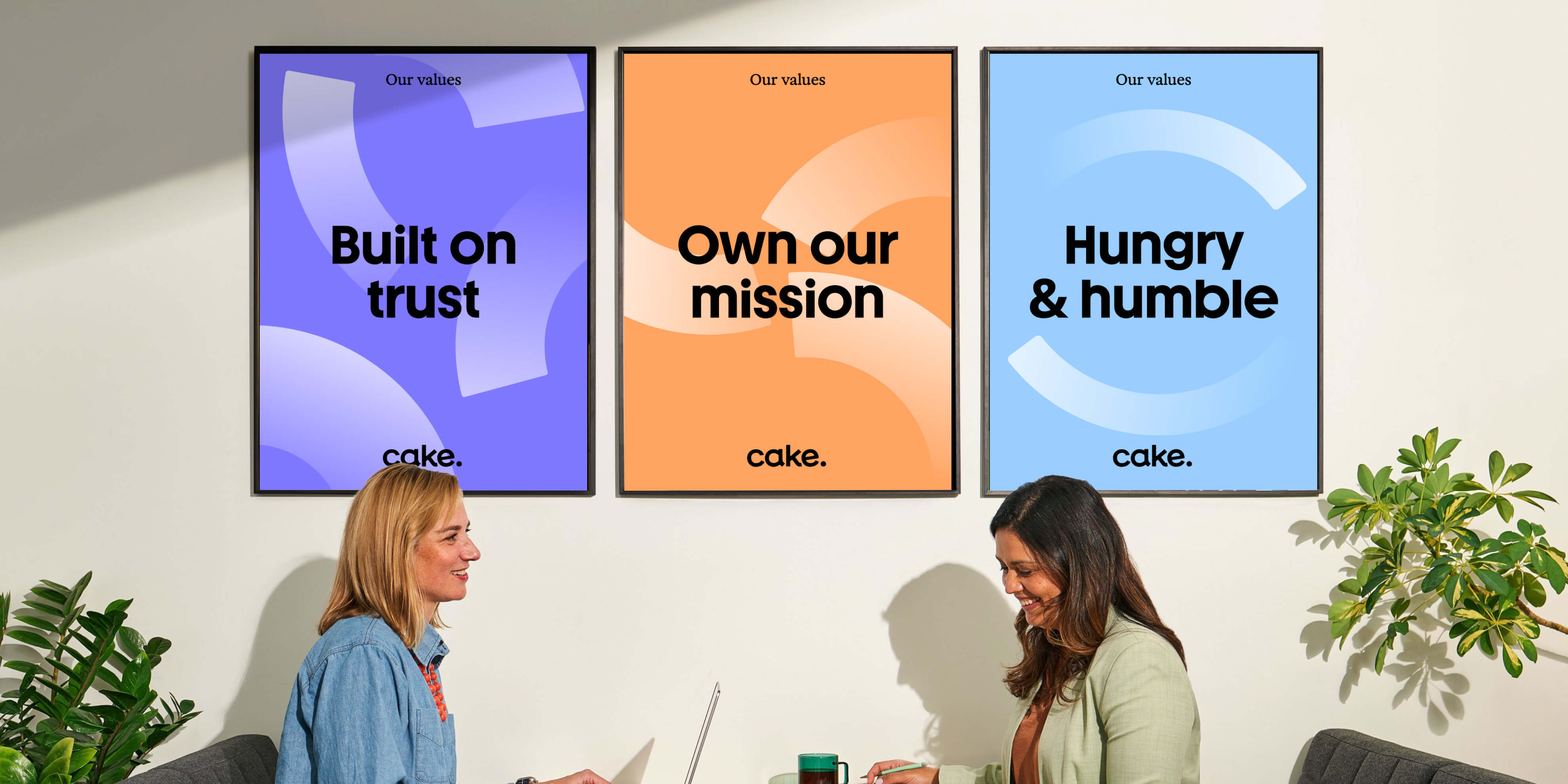
Cake had evolved a lot since launch, but many of the ideas, intentions and cultural elements that made them special hadn't been clearly articulated. Brands that stand for something distinct are the ones that move people and change industries. That's where we started. We set out to uncover what truly makes Cake different, and how that could become a powerful asset both at home and in the US. Through desktop research, interviews and multiple workshops, we distilled the essence of Cake into the key components of their communication. Vision, brand pillars and values took shape. It all culminated in a memorable, distinct purpose: to power the exponential. This speaks to both the financial and start-up nature of their product, and their bigger goal of transforming traditional employment dynamics.


02.
Evolving the Brand Identity
During the strategy phase, we conducted an audit of the current identity: from typography and colour through to illustrations and photography. We agreed it had served Cake well, but there was an opportunity to better communicate their mission to the world. We set to work and evolved the identity around a creative idea called "flow." Flow captured Cake's belief that the work of tomorrow isn't split between the office and home, weekdays and weekends. Instead, it's more aligned with values and lifestyle; sometimes it's easy, sometimes it's hard. We're no longer cogs in a machine — we're working together and appreciating the humanity behind it all.
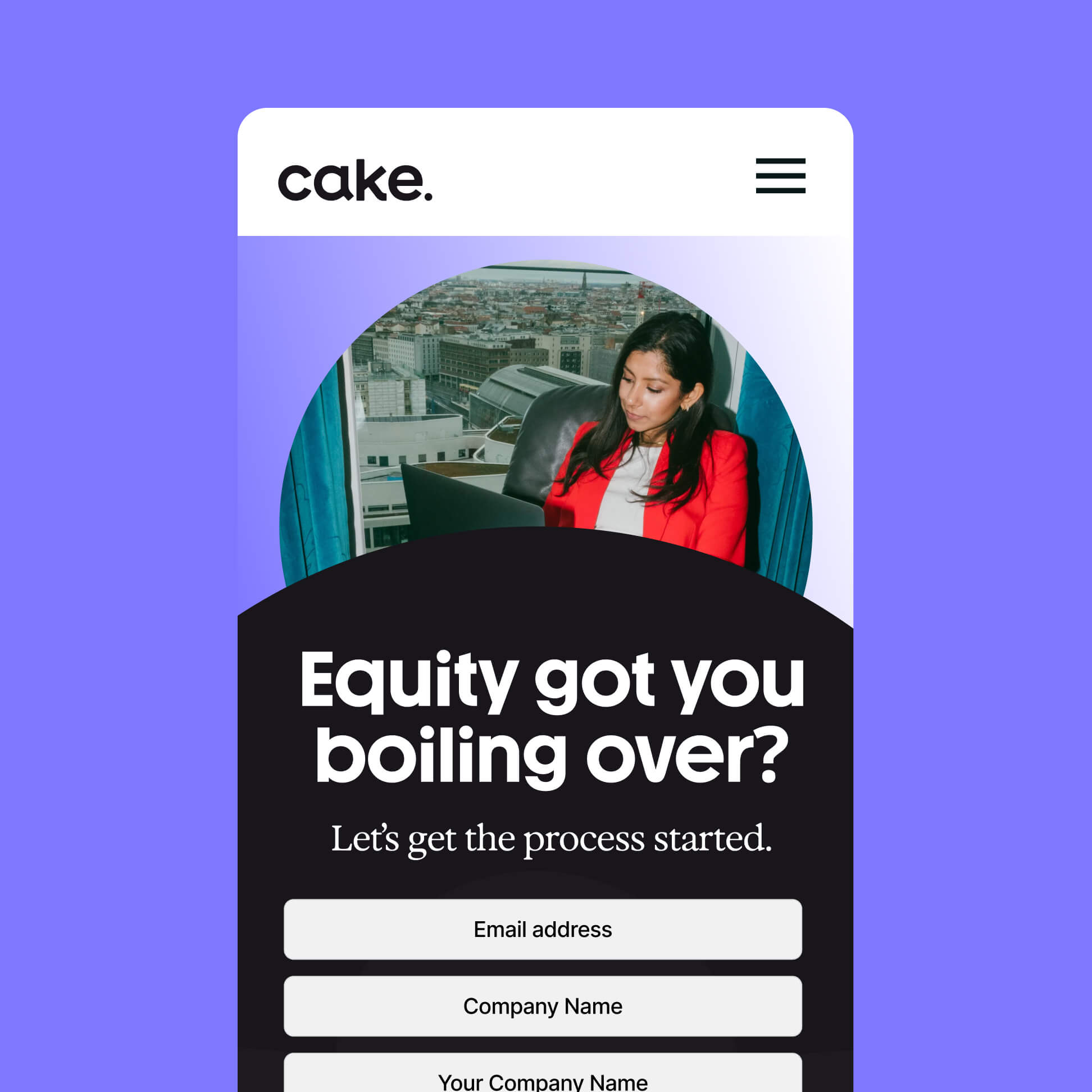
After exploring both logomarks and wordmarks, we landed on a custom wordmark that evolved the original by injecting this sense of flow. The result is a more memorable mark, with a clear link back to where Cake started.

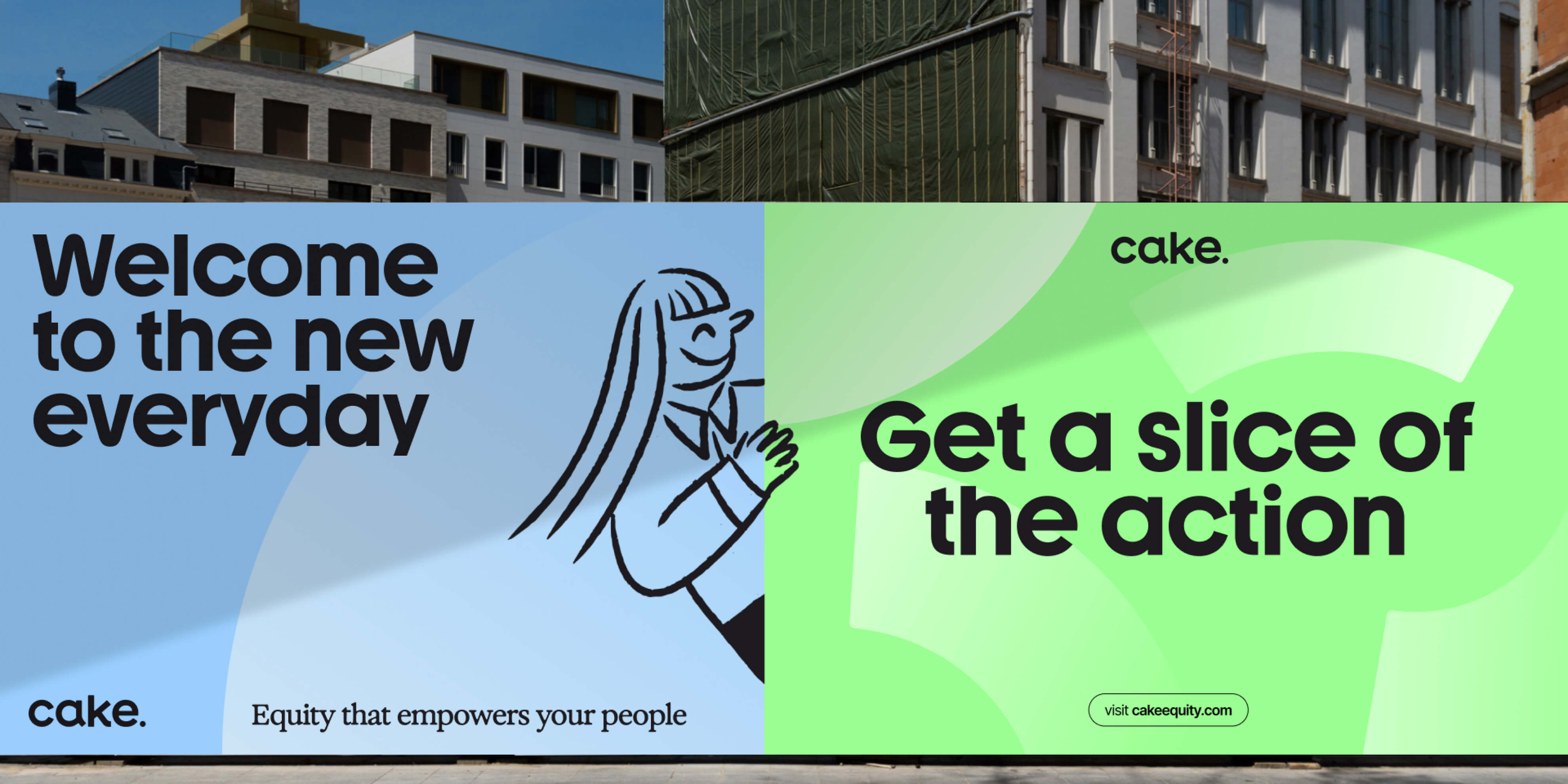
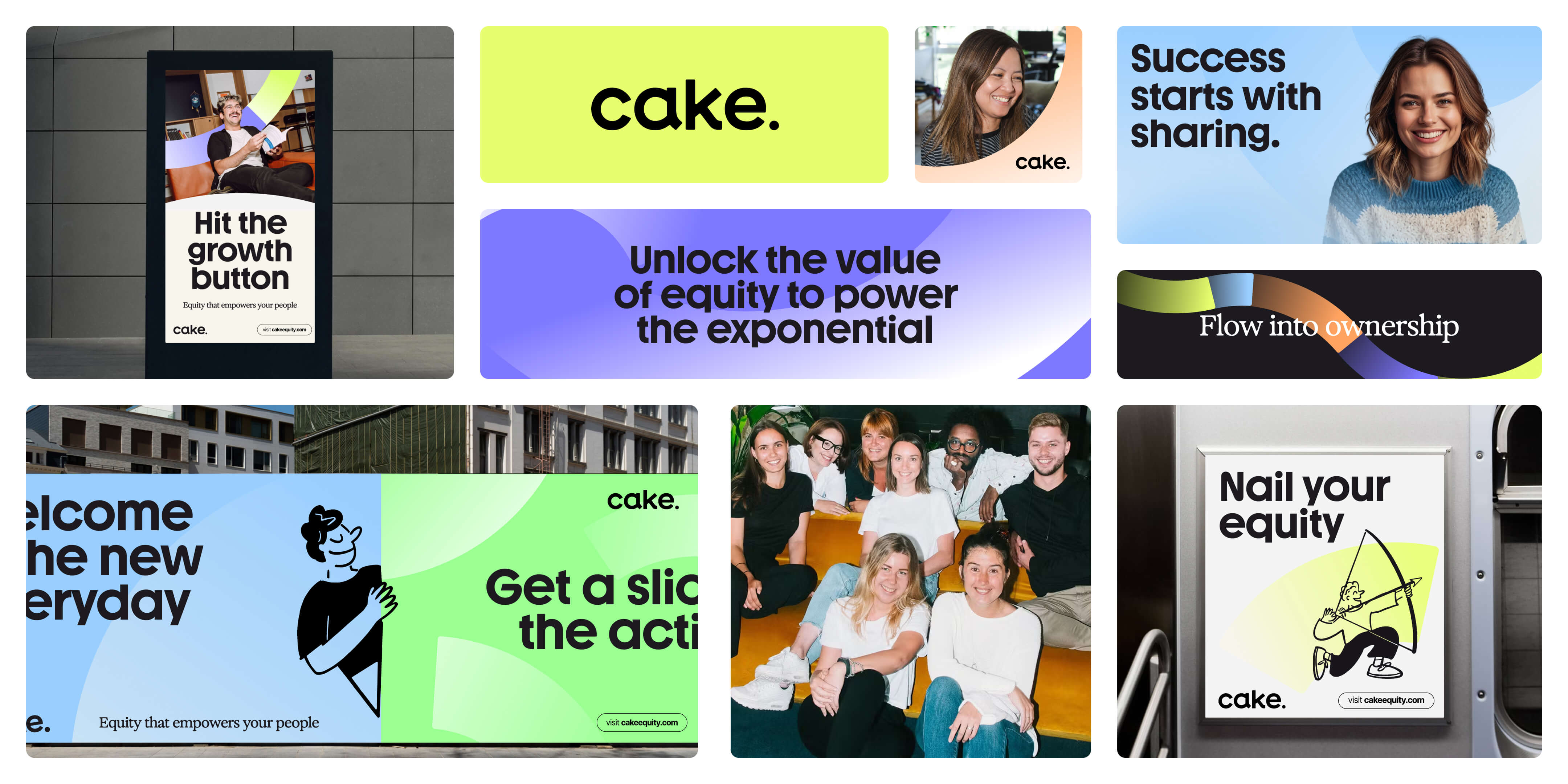
A unique graphic device was created to extend the identity further. Born from the familiar doughnut-style chart, it was reimagined with gradients and crops to reinforce the idea of flow. Versatile by nature, it works as a frame for illustration and photography, or simply as a visual injection to support copy.

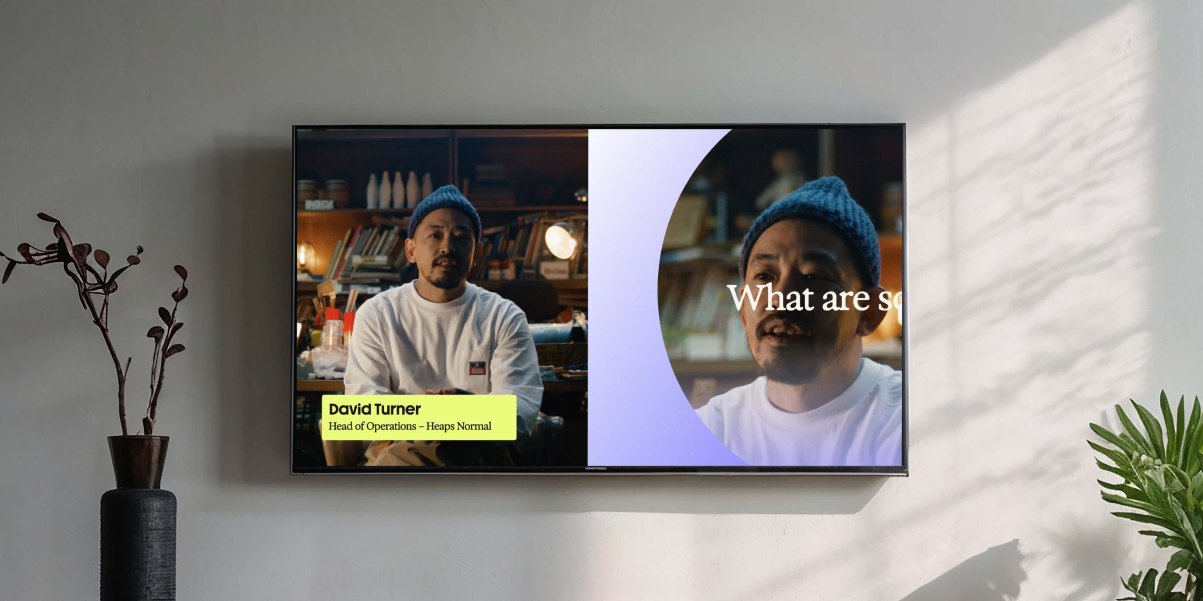


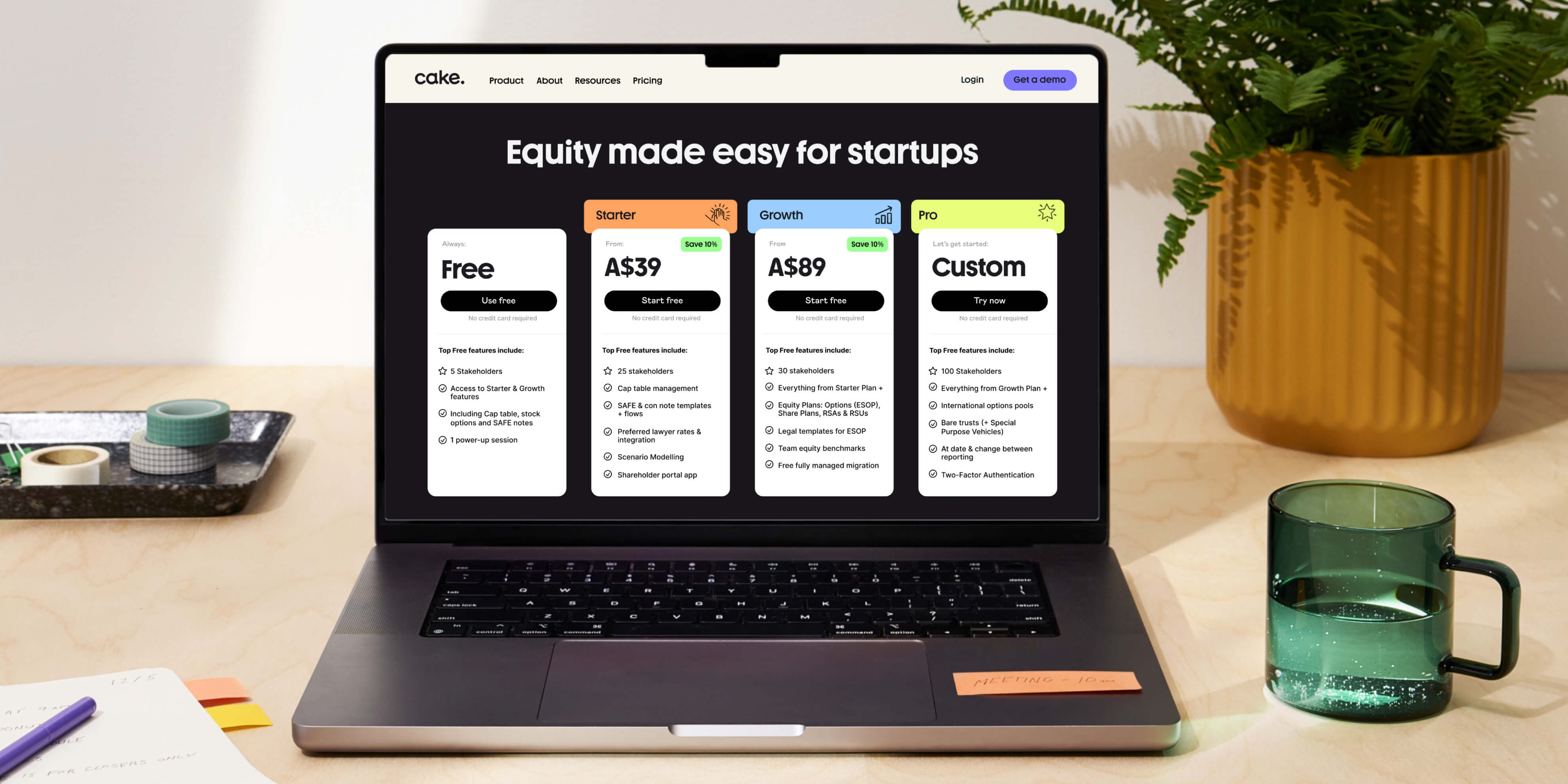
Illustration and photography styleguides gave Cake another way to express the world of founders and their teams. Custom iconography was developed alongside, feeding directly into the product UI. The brand strategy and brand identity development work done here doesn't stop at the visual surface — it runs all the way through to the product itself.