01.
Refining the Brand Identity
Flagship came to us with a logo, some fonts and a rough idea of their primary colour. We reviewed the existing assets and, while there was nothing technically wrong, there was a clear opportunity to do more. A thorough brand identity review would solidify their visual direction and open up real scope for expression through imagery, illustration and animation.

The wordmark was refreshed, along with new typefaces for headlines and subheadings that gave the copy more personality. Purples remained central, complemented by a vibrant secondary palette that gave the team more to work with. A concise brand guidelines document pulled the essentials together.

02.
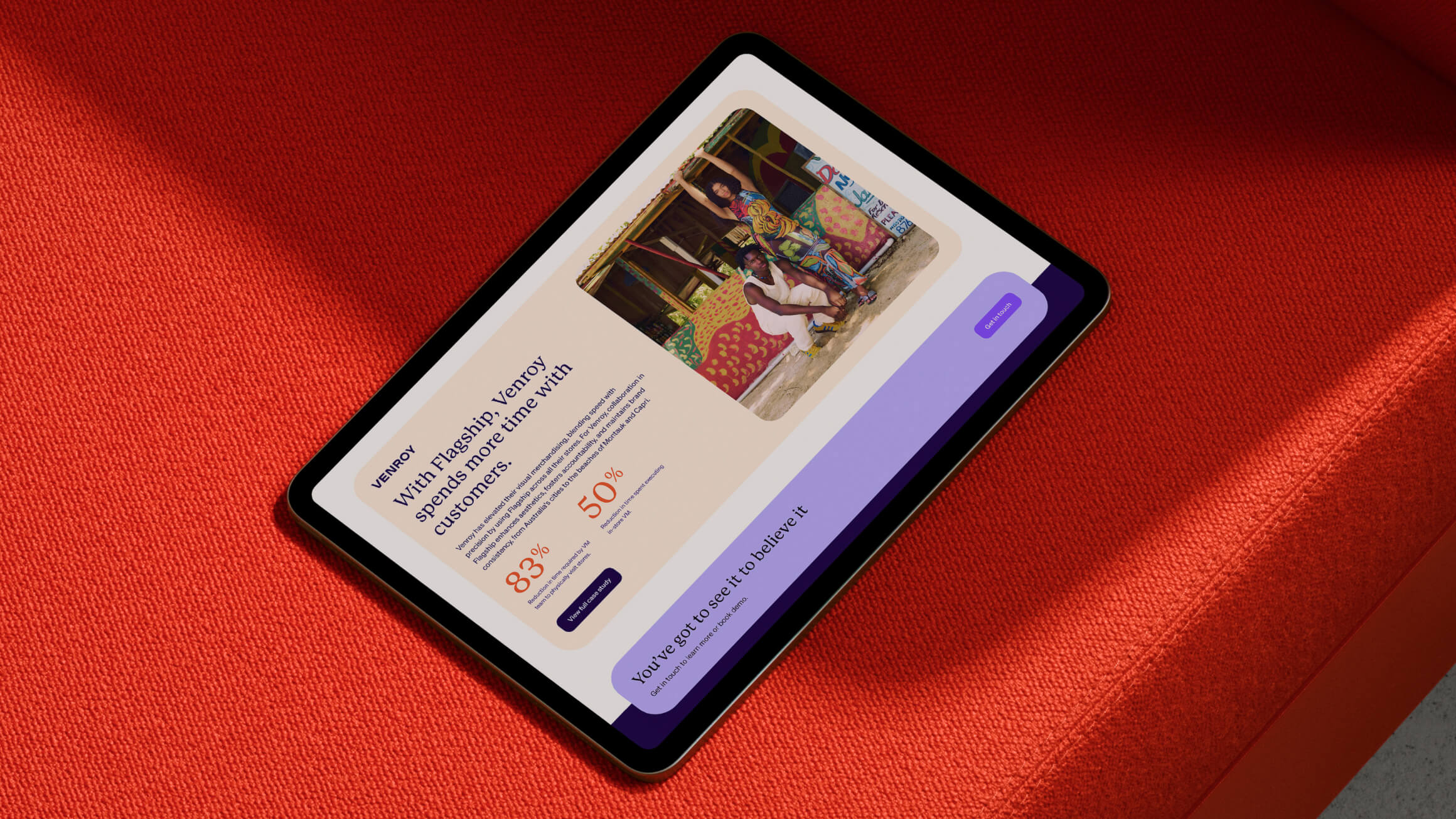
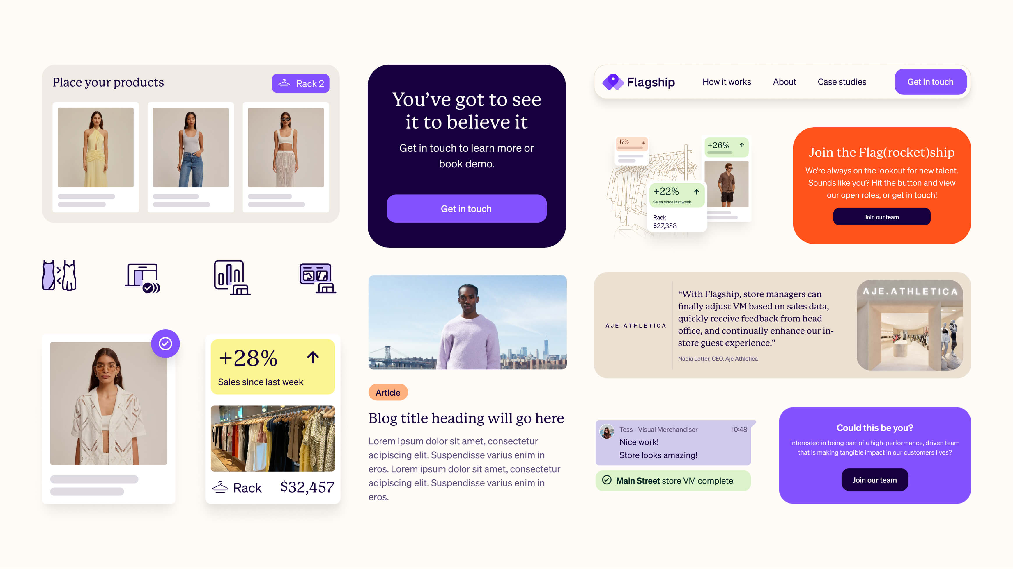
Designing Flagship's website from the ground up
The website was designed entirely from scratch, with our teams working closely at every stage. The goal was to present the power of Flagship's offering without getting lost in the complexity behind it.
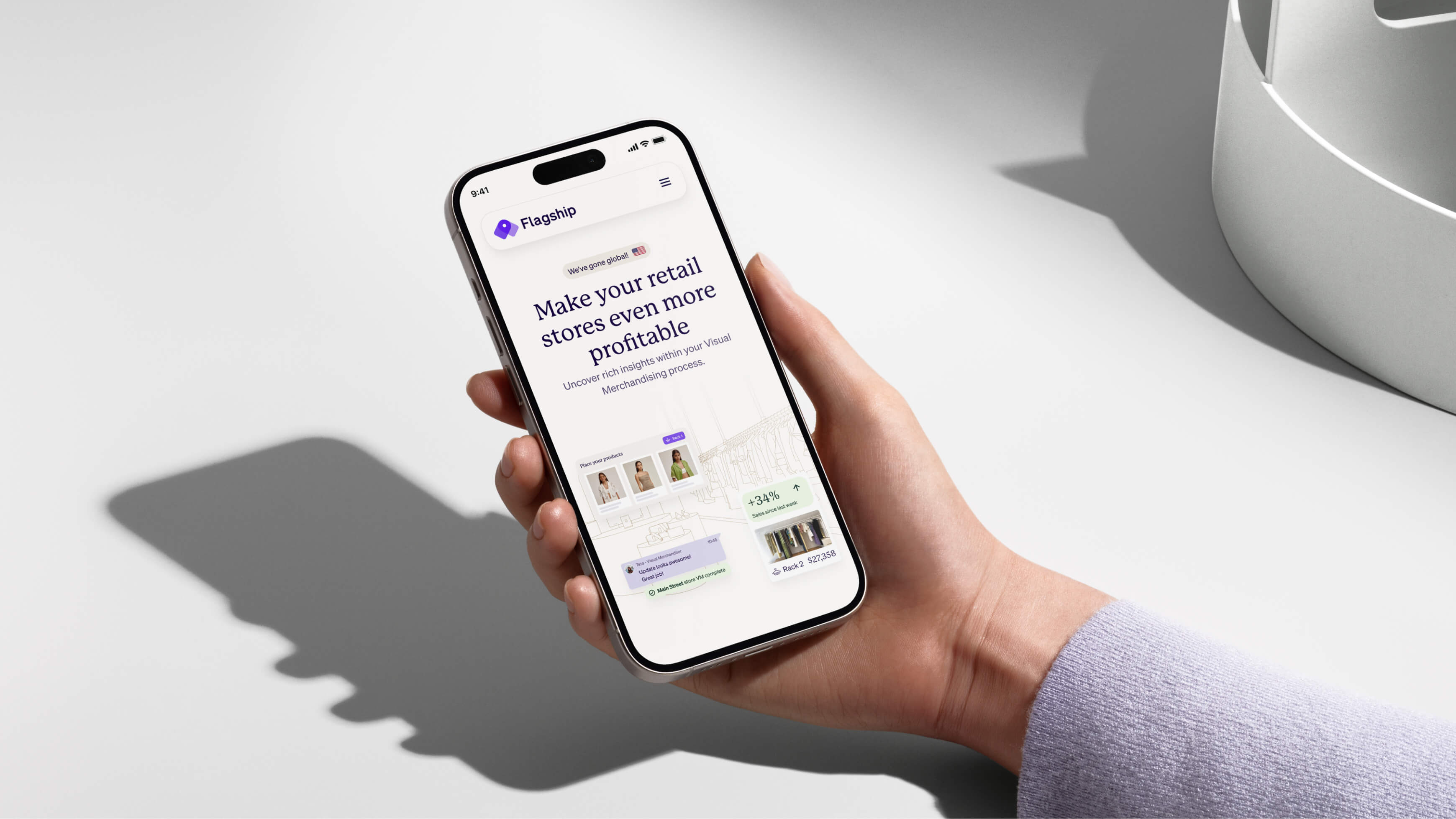
Key features were shaped into clear, purposeful copy across the site — genuine benefits in everyday language. Custom illustrations, photography and UI designs came together to show audiences just how collaborative and straightforward Flagship can be. Now live at flagship.ai, the brand identity work gives full expression to Flagship's merchandising technologies for retailers worldwide.