01.
Unlocking potential
The team at UntilNow spent weeks researching, interviewing and workshopping what made PropHero unique and how that truth could be put to work for them. Through customer and staff interviews, we discovered that it wasn't the technology or the human expertise alone that made the difference. It was the fusion of both. That combination was genuinely differentiating and defensible. We dug deeper.


With a name proclaiming heroism, they needed to convey confidence. But there was no need for a cape and stars. We discovered that their brand archetype was the magician, not the hero. With a magical blend of human and artificial intelligence at the core of their brand identity, PropHero could transform physical property into a digital, high performing asset without the investor ever being handed the keys. That was the magic.

02.
Redesigning the brand
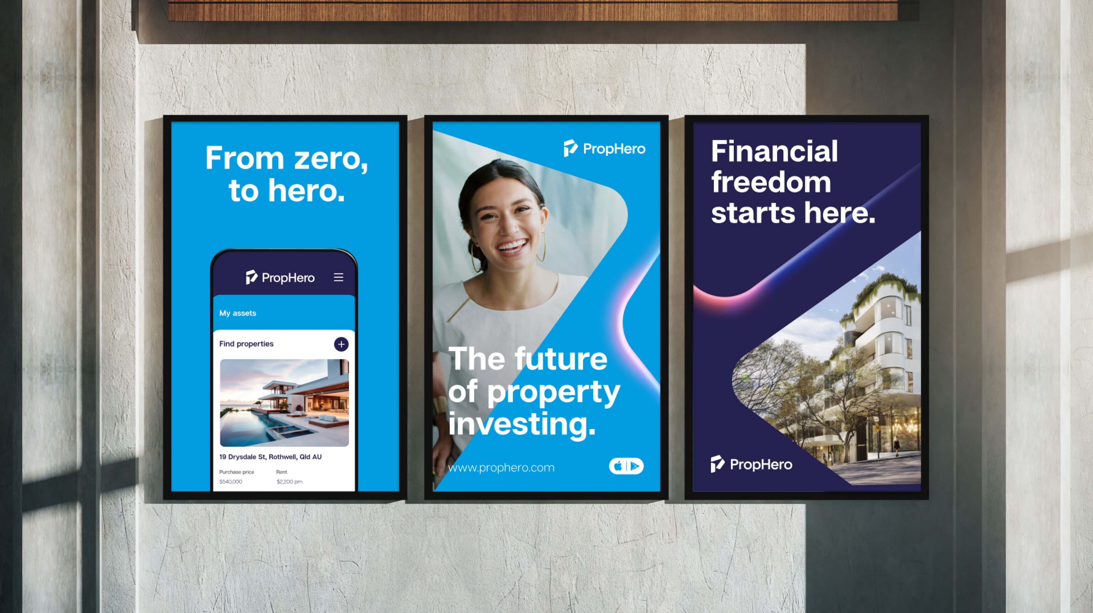
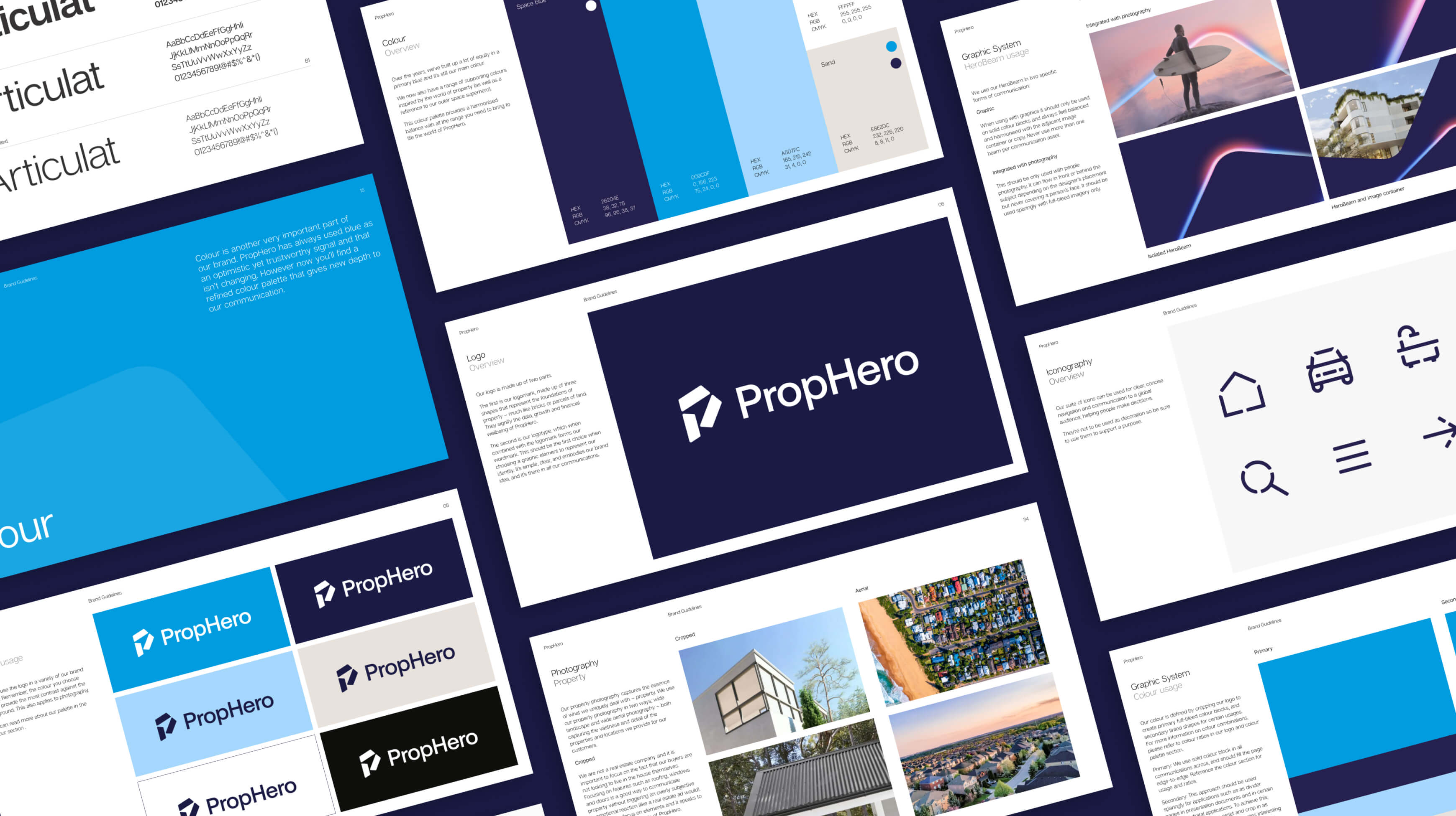
We began with the logomark as it was foundational. After hundreds of wordmark and symbol explorations, we landed on a powerful symbol. Comprised of three parcels, like land, and built around the strength of a pentagon, we crafted a P that held an upward pointing arrow inside its negative space. Despite its simplicity, the logo held real depth of meaning. But the pentagon wasn't a pentagram. Where was the magic? Where was the heroism? We looked to symbols of magic: sparks from wands, the view of earth from space. We imagined PropHero soaring, a new day dawning. The HeroBeam was born.
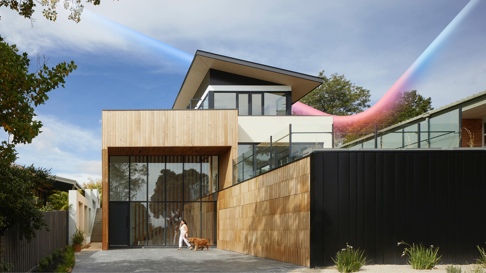


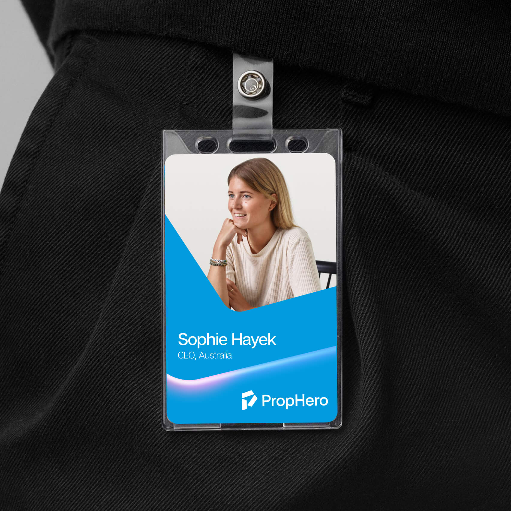
Following the curve of the parcel shape, the HeroBeam became a versatile graphic device across the full brand identity.

0.3
Bringing it all to life
We now needed to paint the future for PropHero. The personality was bold, optimistic, clever and magical. How would that translate to the world?


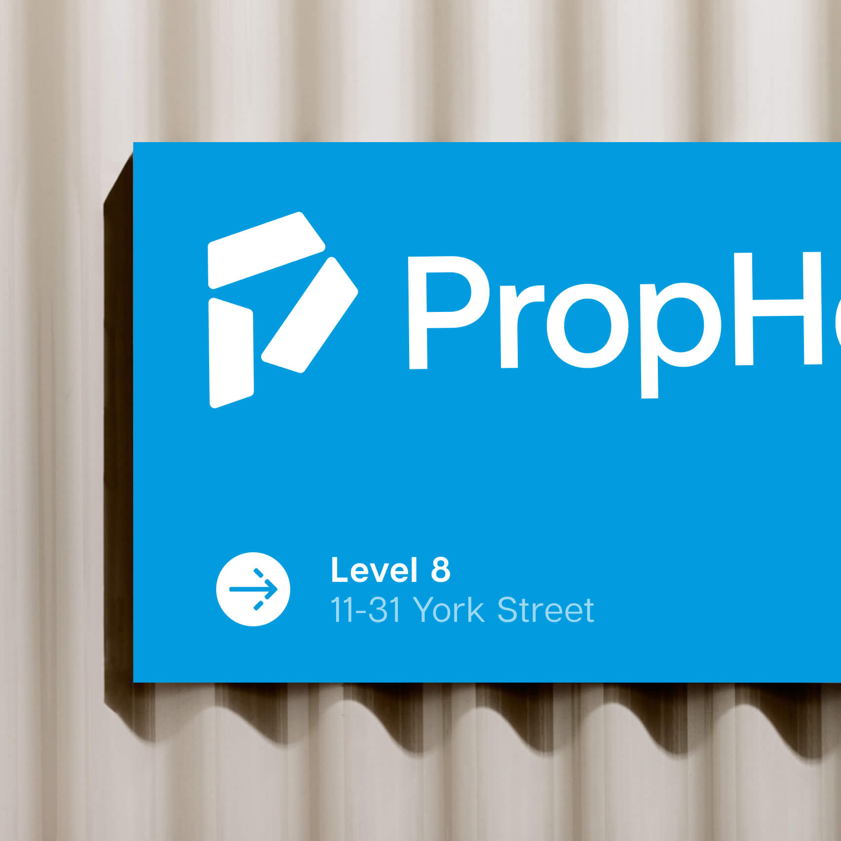
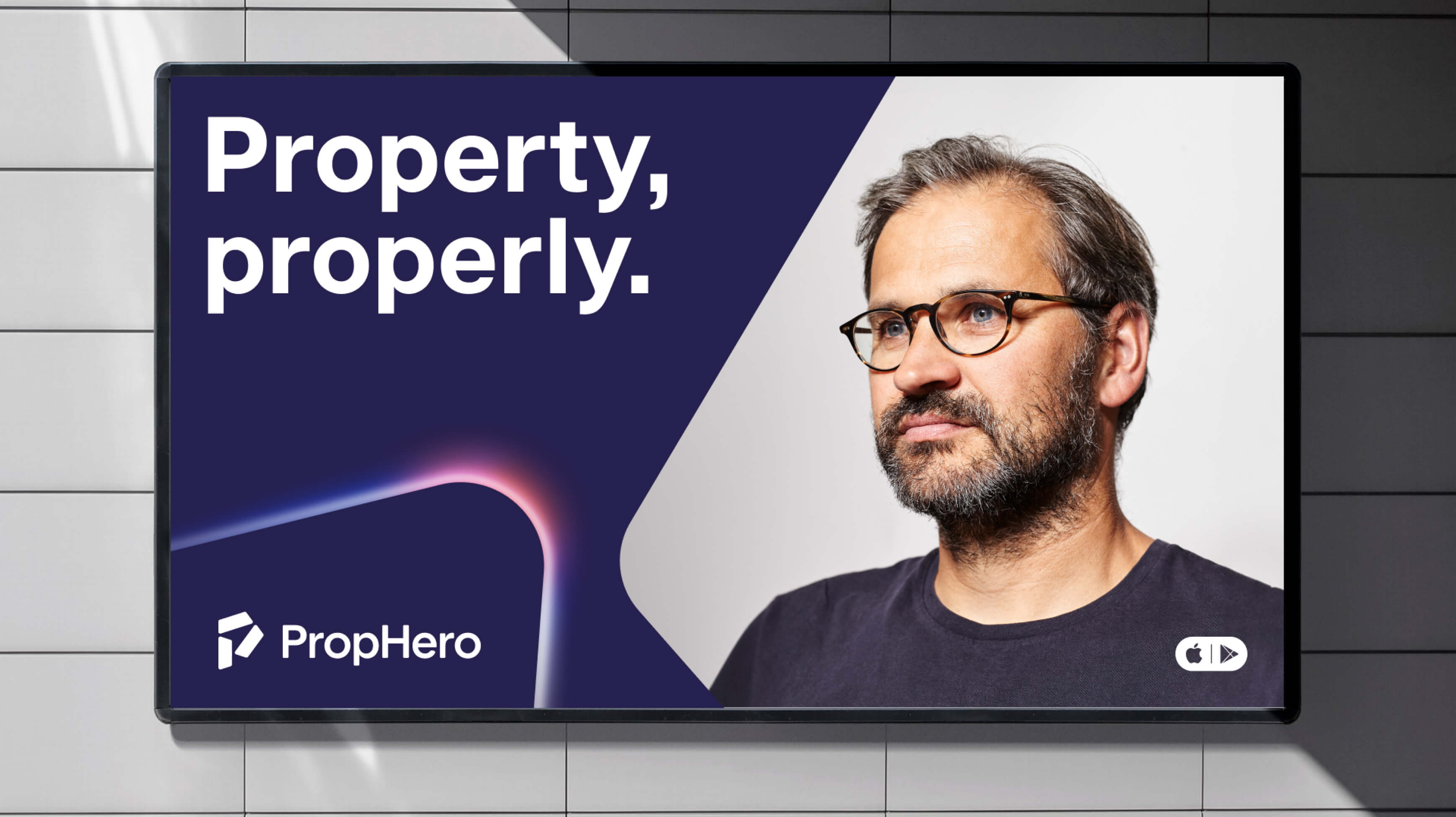
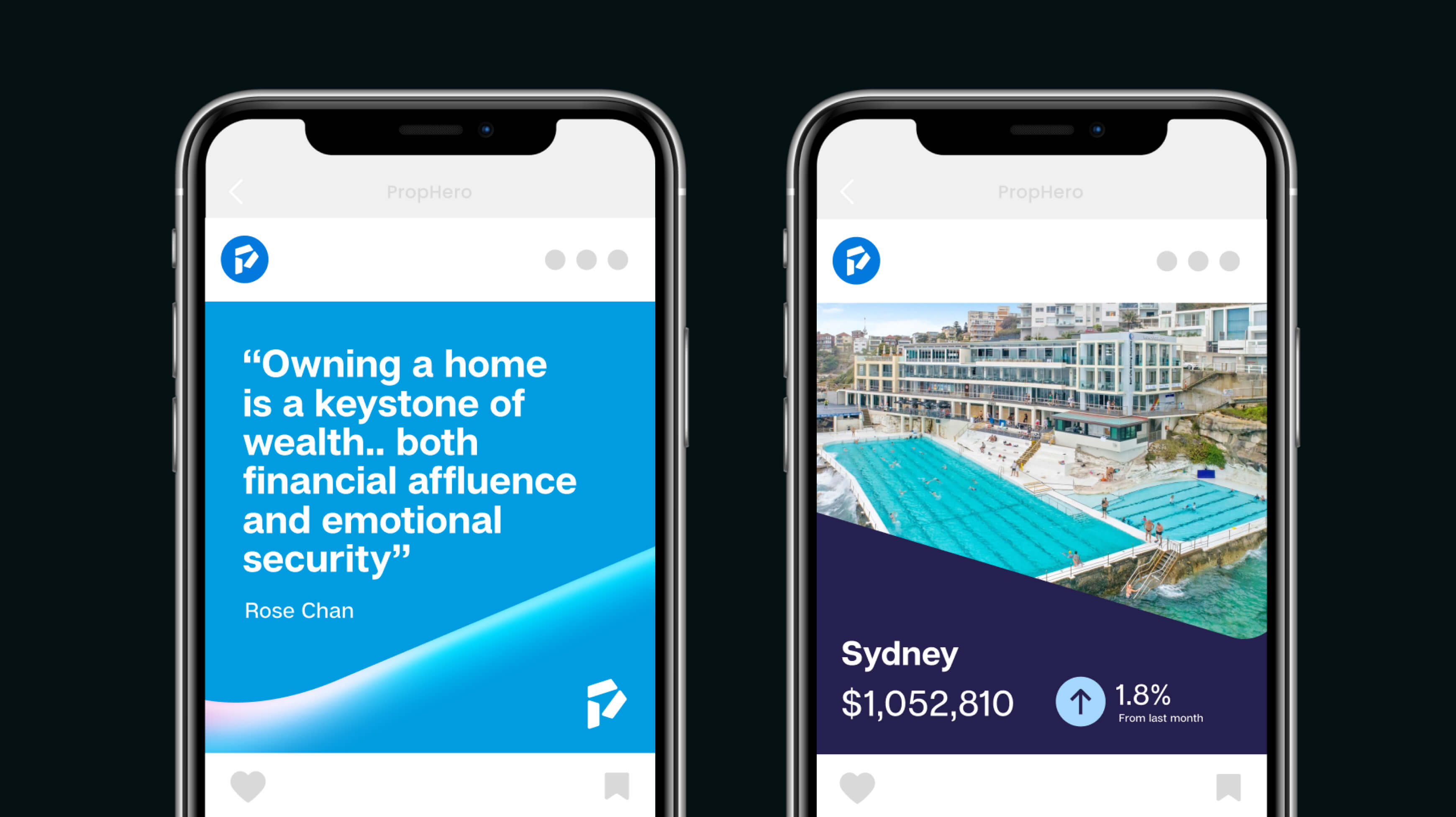
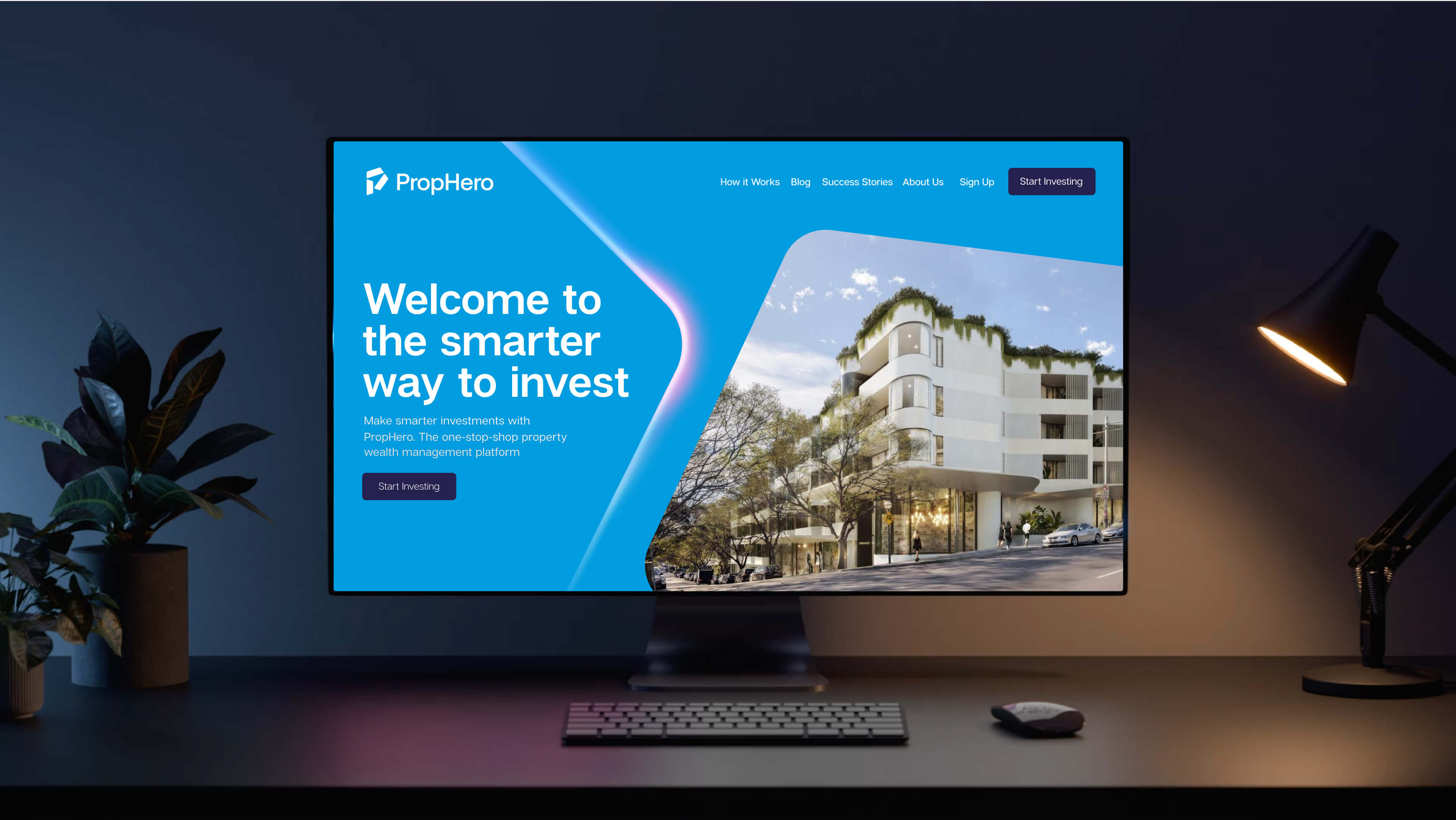
Exploring digital and physical applications of the brand confirmed its versatility. Instructional templates were designed and step by step design tips helped the rollout reach its full potential.

We're genuinely excited to see this brand identity make its mark as PropHero expands across the globe, opening new offices and changing how people invest in property.