01.
Pocket money goes digital
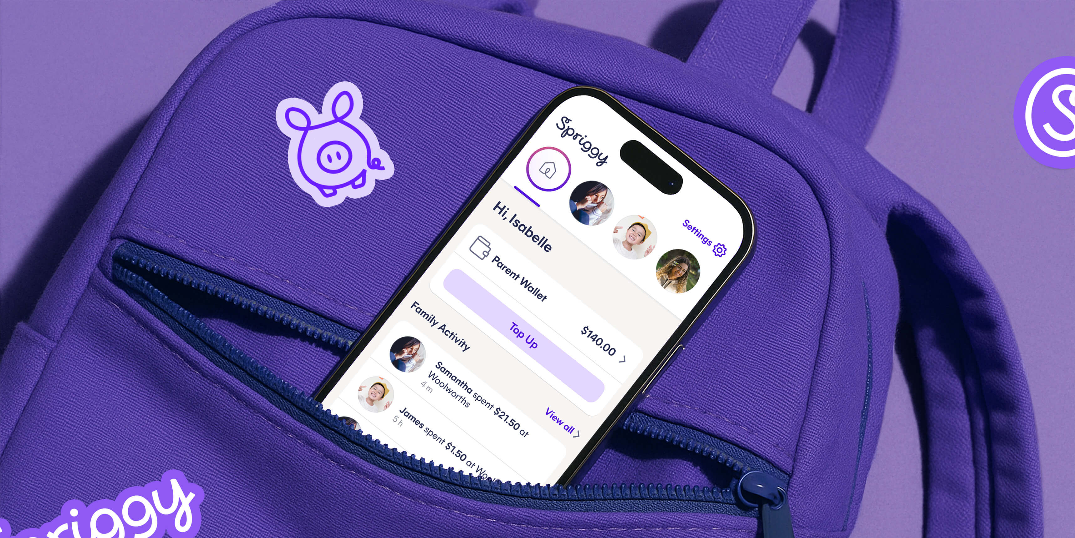
Most parents believe having a day-to-day understanding of money is essential for children to learn, yet many struggle with how best to do this (or finding the time). With the adult world having migrated largely to online payments, Spriggy's market entry was perfectly timed. After finding initial traction with the Pocket Money app, the team engaged UntilNow to overhaul their user experience. A faster, more intuitive app would power Spriggy to scale further.


Our first engagement with Spriggy was focused on improving the information architecture of their flagship product. We redesigned key interactions, making it easier for parents to quickly check their children's card balances, navigate between multiple kids and to load money on to individual cards at speed.


02.
Powering brains (and bellies) with Schools
Next, Spriggy invited us to contribute to their Schools app. This product provides a simple payment gateway for everyday school expenses such as uniforms and canteen food. The technology integrates directly with the children's school canteen to help parents plan and pay for meals during the week. At the merchant end, schools can update their stock — whether it's a new sandwich or a sports uniform — and load it into the portal for parents to see.


UntilNow supported the Spriggy Schools app in two key ways. First, we provided a design experience that modelled the information architecture originally developed for the Pocket Money app. Then we integrated the visual identity to ensure consistency across the suite of products. The Schools app continues to evolve in its UI/UX design and functionality.


03.
Expanding into Investing
Now that kids could save, spend and earn on the platform, Spriggy wanted to round out the journey of financial literacy by expanding into investing. Enter Spriggy Invest — a sophisticated, yet accessible investment platform. UntilNow delivered a successful beta design, with innovative UI features including investment goals.


Invest offers 5 options constituting a blend of ETFs and shares — Aussie Top Stocks, Global Technology and a High Growth option among them — with simple data visualisation that flows consistently from the familiar design system built in Pocket Money. Invest allows parents to invest alongside their children sooner and explore the global stock market together. To support this, the app includes an educational onboarding for parents.


04.
Retaining users with SPRK
As children move into adolescence they seek more independence in their banking and debit card use. To help maximise customer retention, a number of new features needed to be made available. The new design also had to strike a balance: extending the Spriggy offering while looking and feeling more aligned to the apps and experiences teens were increasingly using.


We helped Spriggy launch a teens offering called SPRK mode, with advanced features including ATM access and instant, peer-to-peer payments between friends. To make that separation clear and cater to this notoriously hard-to-please audience, we applied a new brand design throughout the entire app in collaboration with Spriggy's Creative Director. With a highly customisable colour palette and a striking new logo, the modern interface resonated strongly with teens and drove higher retention for the product overall.


